The Message is Medium Rare

The Message is Medium Rare

  • Burgers
  • Index
  • About
  • Facebook
  • Digest
  • Press

No. 24: The Wisest and Stupidest of Men

8.25 at Red’s Java House
June 19, 2014 by Christopher Simmons in ★ ★ ★

★ ★ ★ Red’s Java House has been a fixture of the San Francisco waterfront since the 1930’s. Back then it was called Franco’s Lunch, but despite that moniker offered an infamous breakfast special: a cheeseburger with a pint of beer.

In the eighty plus years since, Red’s has changed hands a handful of times—first in the 1950’s to carrot-topped brothers Tom and Mike McGarvey (who renamed it after their ginger locks) then again in 1990 and 2009. All, by the way, were San Francisco natives. The Pier 30 dive—halfway between ATT Park and the Ferry Building—is an enduing landmark with a bay bridge view and a very satisfying burger.


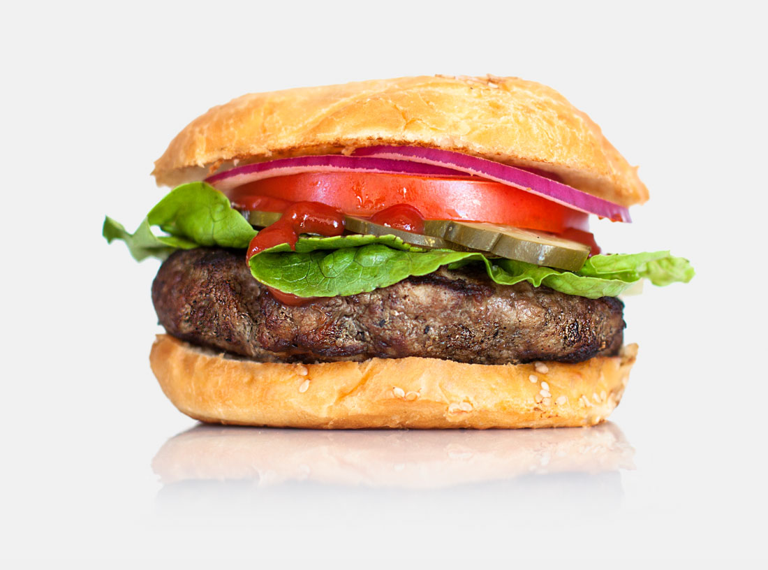
Their signature double cheeseburger is made with two thin all beef patties, grilled in mustard and draped with perfectly melted American cheese. All burgers come topped with chunky pickles and thickly-diced onions. Regular burgers come on a standard bun, doubles are served on San Francisco sourdough. The latter is definitely the way to go. The bread has the elastic chewiness of good sourdough. Chewier rolls have the frustrating tendency to squeeze out their contents (unless you eat them like this), but the rolls at Red’s are oversized and because there's no lettuce or tomato to slide around the sandwich holds up fine. It's a warm, hearty, gooey handful of deliciousness. The onions and mustard give it a bracing pungency. The pickles and sourdough a mild tanginess. There’s ketchup and hot sauce on the table if you want it, but honestly the burger is great on its own. 

The walls at Red’s Java House are covered with framed photos and newspaper clippings—souvenirs of San Francisco past. I happened to sit at a table below a series of photos showing my neighborhood in the 50’s, just before my house was built. Back then our street wasn’t even a street—just a grassy hillside above some wetlands that would soon be drained and filled in the name of progress. Like the hills and the wetlands, The City has changed a lot since then. The aforementioned ballpark (built in 2000 to look like it was built in the 20’s) has had three names and numerous expansions in just 14 years. The Ferry Building, which predates Red’s, has also seen numerous transformations—from an active transit center, to office space, to a bustling restaurant and shopping arcade. San Francisco itself has morphed into different incarnations of itself time and time again. Through it all, though, Red’s has remained focused, and humble and small. It feels like a real place, a place with an honest sense of history and a sincere sense of self. 


The Creative Lesson

Only the wisest and stupidest of men never change. (Confucious) When a business finds success (as Red’s has) the temptation is to grow. “How can I scale this model so I can make more money from more people in more places?” But not everything is built for growth, and not everything needs to be.

I’ve run my own design office for ten years now. We’ve always been three people and we’ve always worked from a home office. People often ask me when I’m going to move to a larger office, when I’m going to hire more employees, when I’m going to grow the business. In short, they’re asking, “When are you going to change this thing you love into something else?” The answer is, I’m not.

Growth works for some people and it’s more or less The American Way. Sometimes, though, success depends on not growing, on not chaning. Sometimes it depends on remaining small enough that you can stay close to the work, close to your customers and close to your life.


June 19, 2014 /Christopher Simmons
★ ★ ★

No. 21: Two Guys Walk Into The Mission…

$11 at Starbelly
May 28, 2014 by Christopher Simmons in ★ ★ ★

★ ★ ★ Starbelly is a casual Castro neighborhood café serving California comfort food in a typically laid back atmosphere. Known for their pizzas, creative wine- and beer-based cocktails, and late hours (by San Francisco standards), they also make a fine burger.

The patty is half pound of Prather Ranch ground sirloin and comes with all the traditional fixings: lettuce, tomato, onions, and the same house-made pickle we discussed in our review of Super Duper (Starbelly and Super Duper are under the same ownership). The challah bun (Pinkie’s Bakery) is super fresh and deliciously buttery, if a tad on the flakey side. We ordered our burgers medium rare (of course). Nathan’s came medium while mine was medium well. Overall the burger was filling and flavorful. Starbelly’s commitment to sourcing quality local ingredients made a positive impression, but the overcooked patty kept us from giving it four stars.

Full disclosure: Starbelly’s owners are clients of ours and we’ve just helped them brand and name their latest restaurant. While we didn’t have anything to do with naming Starbelly, I’m friendly with the people who did, and our former intern designed the logo.

Out of genuine curiosity, I asked our server about the meaning of the name. This was his answer:

“We paid a couple of guys in The Mission to come up with 2,000 names for us. Then the owner’s kids picked the one they liked best.”  

So many things about his explanation are revealing about non-designers’ perception of the creative process, that we had to make it this week’s lesson. Let’s break it down:

First, I love that he characterized their creative partners as “a couple of guys”—not the name of the agency or even, broadly, that is was an agency. Just two dudes. It makes it sound like they took a stroll down Valencia street looking for talented hipsters with access to post-it notes and a dictionary. For those readers unfamiliar with San Francisco, The Mission District is a rapidly-gentrifying corridor once home to muralists, thrift stores, and dance companies and now widely viewed as ground zero for third wave coffee and mustache wax. I love that our server invoked the designers’ location as their sole qualifying credential.

Second, it is telling that he framed the process as “paying…for 2,000 names.” In naming quantity often is inherent to the process, but the truth is you’re paying for one name (or rather, the expertise required to craft a name)—it just may take 2,000 to get there. Viewing design as a quantitative exercise rather than a qualitative one is troublingly common. It suggests that if, after considering the first 2,000 names (or 20 tag lines, or 10 logos, or whatever), you haven’t been introduced one you like, then another 2,000 (or 20 or 10 or whatever) might do the trick. But that’s probably not going to happen. The real trick is to strive for better understanding. Maybe the designer needs to ask new or better questions. Maybe the client needs a new or better way to evaluate the options. Maybe both parties need to revisit the goals, criteria and parameters. It’s the difference between investing and simply playing the lottery.

Lastly, the assertion that the decision was ultimately made by the owner’s children—while probably apocryphal—highlights an important dimension of our cultural relationship to expertise. Since I happen know the “two guys in the Mission” I can tell you that one of them has an MFA in writing, the other a BA (from Harvard) in the Philosophy of Language and Aesthetics. They are qualified and experienced professionals who were hired for their expertise. Since I also happen to know and work with the owner and recently named a new restaurant for him. I can attest to his design savvy and the intense consideration he gives every aspect of his business. Decisions are sometimes made intuitively, but never lightly and always in the context of a considered and well thought out strategy.

It may make for a good punchline to contrast the image of a couple of young hipsters spending weeks churning out thousands of names with the image of a couple of children picking their Seussian favorite, but it’s probably not accurate. And while it pokes light-hearted fun at the apparent futility of creativity—even evoking the common lay-criticism, “My five-year-old niece could have done that!”—it assumes a dispiritingly cavalier attitude toward professional creativity.

In fairness, my exchange with our server was brief. He probably wasn’t involved in the process, and simply provided the highlights of a story he’s heard second hand. I’m not faulting him in any way. It’s a good-sounding story, easily told and easily shared. It is also a humbling reminder of how the design process is viewed and valued by those outside looking in. 


The Creative Lesson

Design design. Design, like any profession, is a specialization. It has its own language, customs, rules, references, history and heroes—most of which are opaque to those outside the profession. Our server’s characterization of the designer-client relationship was a harmless (and amusing) misunderstanding; one that didn’t account for the rigor, perspective or politics of the project. Sadly, however, many should-be savvy clients also suffer these same misapprehensions.

Perhaps part of the reason is that we (designers) haven’t done an adequate job of branding the idea of design. If our cultural fluency with design is to improve, designers and design organizations are going to need to do a better job of making clear what we do, how we do it, and why it matters. We need to do a better job of telling our story.
May 28, 2014 /Christopher Simmons
★ ★ ★
mine_mission_beach_cafe.jpg

No. 18: A Tiny Tomato

$13.50 at Mission Beach Café
May 07, 2014 by Christopher Simmons in ★ ★ ★

★ ★ ★ Mission Beach Café has occupied the sage green Victorian at the corner of 14th and Guerrero since 2007. The tightly-packed space is sophisticated but laid back. Its high-backed chairs and soft carpeting are playfully at odds with the oversized photographic prints of abandoned warehouses that line the walls and the vintage Eames screen that separates the dining are from the kitchen. A single red wall accents an otherwise neutral interior.

To our left a mother and daughter shared a leisurely lunch. Behind us one casually- but well-dressed man earnestly tries to impress another, his blue eyes never breaking contact with his counterpart across the table. It’s unclear whether he’s on a date or a job interview. Behind them two gentlemen in their 90s with papery skin and broad smiles take small sips of coffee and enjoy having nowhere else to be. The lone empty table is soon filled by a young couple—he in sandals and a beard, she in a wrinkled blue dress. Their skin radiates the warmth of their spirit and the energy of captured sun. 

Our burgers arrive: two round buns on a round white plate. A thick patty of Prather Ranch ground beef sits atop one of the buns, draped with a melting slice of aged gouda and some caramelized onions. Deep grill marks char the underside of the other bun, on which rests a broad leaf of lettuce. A small pile of golden fries (expertly cooked, by the way) adds a little chaos amongst the order. Finally, a tiny slice of tomato punctuates the scene.

The tomato is an enigma. Singular and no bigger than a silver dollar, it adds almost nothing to the flavor of the burger. When I finally do happen upon a bite, it is a distraction from the otherwise savory combination. We wonder aloud what could be the point of it. Everything about the burger is nuanced—the salted Lost Coast beef, the smokey aged cheese, the zesty garlic aioli, the sweetened caramelized onions, right down to the perfectly grilled bun. And then we realize we’ve misunderstood the tomato’s purpose; it’s not a gastronomic statement, but an aesthetic one. Removed, the plate is uniform and unexciting. It needs a moment of contrast to bring the dish to life. Like a pocket square or Christian Louboutin sole, it is a moment of exuberance that frees form from the strict confines of function. 

To see for yourself, visit our Facebook page for a side-by-side comparison. Better yet, head on over to Mission Beach Café and enjoy one of the better burgers San Francisco has to offer.


The Creative Lesson

Form is Function. When questioned about whether or not design should be useful, Charles Eames answered, “Yes” but warned that the “use” might be very subtle. Considered as an ingredient of the burger, the tomato isn’t particularly useful. It is an extraneous formal element for which (as far as flavor is concerned) there is no functional justification. Considered as an element of expression—an ingredient of the visual experience—its function is essential.

Beware of slavishly tethering yourself to single interpretation of function. Consider wit, whimsy, joy, and style for their functional dimensions as well.
May 07, 2014 /Christopher Simmons
★ ★ ★

No. 17: It’s All in Your Head

$11 at Pal's Takeaway
April 30, 2014 by Christopher Simmons in ★ ★ ★

★ ★ ★ By night La Movida is a casual restaurant and wine bar. By day it is home to Pal’s Takeway, a tiny sandwhich shop full of big ideas. Every other Wednesday Pal’s also serves burgers.

Pal’s is all about experimentation. Owner and chef Jeff Mason is constantly tinkering with his recipes, regularly creating new sandwiches and serving up creative takes on old favorites. There’s no guarantee that any given sandwich will be on the menu from one day to the next so each visit requires a leap of faith, the reward for which is sheer delight. Here are a few of Jeff’s past creations (click here if you want to skip straight to the burger):

Smoked Trout
With daikon sprouts, spicy apples, and labneh

Roasted Turkey Breast
With bacon, pimento-cheddar spread, and arugula

Cold Poached Albacore
With cornichon, arugula, roasted cherry tomato relish, and potato chip (yes, in the sandwich)

Banh Mi
Becker Lane Lao roast pork with Blue Herron baby scallion, cilantro, carrot, daikon, cucumber and jalapeño

Egg Salad
Riverdog real free-range egg salad with asparagus

Roasted Pig
With cheddar ale sauce, pickled shallot, wild arugula, and mustard

Lamb
Sonoma baby spring lamb porchetta with roasted eggplant yogurt dressing, pickled onions, greens, and Aleppo pepper

Pork Sliders
Becker Lane pork with choice of hoisin, ginger, lime, and black coffee BBQ sauces

Pal’s also sources some of the finest breads around. Here in the Bay Area we’re so spoiled on Acme Bread as a kind of everyday loaf that it’s hard to remember just how exceptional it is. Depending on the creation you may find your Pal’s sandwich between two slices of Acme, Josey Baker, or Fireband. Our burgers were served on a beautiful, sweet, fluffy bun from Marla Bakery. 

About that burger.

Jeff developed his patty with Marin Sun Farms using a combination of sirloin, brisket, chuck, and dry-aged beef fat. It’s a fantastic, very juicy, five-ounce piece of meat which he smash grills until it forms a crisp crust. The inside is so rare that in any other establishment you’d probably send it back. But Jeff knows what he’s doing and we enjoyed ours without incident. Like his other sandwiches, the burger offering varies constantly. On our visit we were treated to toppings of arugula, roasted cherry tomatoes, and a house-made pimento cheese spread. Contrasted with the other ingredients, the spread seemed at first a peculiar addition. It was salty and a little spicy—like a dressed up Cheese Whiz. (Quick aside: Kraft's website is as awful as their foods. Someone please help them). Oddly, though, it worked, and after a few bites we came to appreciate it as an indulgence—both of taste and creation. 

Pal’s burger is whimsical and fun. Though we gave it only three stars, it’s considerably better than any other three-star burger we’ve tasted so far. I certainly recommend giving it a try.

After our meal, I spoke with Jeff about his process. How does he constantly come up with new variations? Does he research different foods and combinations? Does he experiment, iterate, and refine? Does he have test subjects who try his concoctions and give him feedback? The answers were no, no and no. “Basically,” he says, “I just dream them up in my head. I know enough about food now that I have a pretty good idea what something will taste like just by imagining it. Then I make it. If it tastes as good as I imagined, I make some adjustments. If it tastes better than I imagined, I serve it.”

Jeff, in other words, is like any seasoned creative professional. Ideas come fast and freely and he has enough practice behind him that he can prototype in his head. He doesn’t rely on research or user feedback to validate his vision. Instead he brings the value of his own considerable experience to the table. He sets high conceptual expectations for himself, and doesn’t launch a new idea until the craft exceeds them. 


The Creative Lesson

Trust your insticts. There’s a place in design for the process you may have inferred from my questions to Jeff: define, ideate, prototype, iterate. A so-called design thinking process would preceed the definition phase with phases for understanding and observing—and include multiple rounds of testing and user feedback at the iteration stage. If you’re solving a complex problem or building solutions at scale these processes are useful and probably necessary.

But design isn’t always about using what other people know to make things that other people want. Sometimes it’s about offering something new—something that comes from a place that no one but you can imagine. I’d argue that the best design always requires an element of intuition. And though most design is made better by collaboration, every once in a while it is the passionate work of a solitary genius.

Go have a Pal’s burger. You'll see what I mean.
April 30, 2014 /Christopher Simmons
★ ★ ★
Umami Burger

No. 16: Accounting for Taste

$11 at Umami Burger
April 23, 2014 by Christopher Simmons in ★ ★ ★

★ ★ ★ In 1908 a Japanese chemist named Kikunae Ikeda patented the process of isolating C5H8NO4Na from seaweed and, later, wheat flour. The compound is more commonly known as monosodium gluatamate but most commonly referred to as MSG. Ikeda saw huge potential for its flavor-enhancing properties and began marketing the food additive a year later. The taste, he thought, was so unique that he coined a new word to describe it: Umami.

Translated literally, umami means “pleasant, savory taste” (as distinct from the four tastes we are biologically equipped to identify: sweet, sour, salty, and bitter). Despite its origin, umami isn’t solely achieved by the addition of MSG. Many foods have natural umami, including aged meat, cheese and shellfish. These foods are naturally high in glutamates and thus impart the umami flavor. In 2009—100 years after Ikeda’s discovery of MSG—scientists discovered that our tongues do in fact have a receptor activated exclusively by glutamate. That same year, Adam Fleischman founded Umami Burger in Los Angeles. It now has 23 locations (including two in San Francsico) with ambitions expanding to 150 or more.

Although your average burger is most likely an umami experience (beef, cheese, and tomatoes all have naturally-ocurring glutamate), the capital-U Umami burger is singularly dedicated to promoting this unique flavor profile. 

Umami fashions its patties from American Waygu beef, which they grind in-house daily (they also make their own buns). To further enhance the umami flavor, the meat is seasoned with soy sauce and dusted with a mixture of ground-up dried porcini mushrooms and dried fish heads. Their signature burger includes caramelized onions, shiitake mushroom, and roasted tomatoes. Shitake mushrooms have a powerful umami flavor, while tomatoes are somewhat subtler. The roasting also brings out a faint sweetness which combines nicely with the earthy mushroom. Finally, a savory (err...umami) parmesan crisp seals the deal. It’s worth noting that, among cheeses, parmesan has the most potent umami flavor with 1200mg of glutamate per 100g.

Besides its flavor, several things distinguish an Umami burger from other hamburgers. The entire burger is hot—no cold juicy tomato, no crisp lettuce. I’ve long held that combination of hot and cold, soft and crisp is integral to the construction of a good hamburger. Even Bar Jules’ completely undressed burger offers a tart, crisp salad as a complement. But Umami eschews this convention, as it does many others, in its tenacious dedication to a solitary flavor experience.

Another distinction is its incorporation of cheese. While you can usually rely on a good cheeseburger to include a gooey slab of melted American or cheddar, Umami’s grilled parmesan crisp adds a savory, delicate crunch. While I personally dislike the flavor, it is a sophisticated choice that many will appreciate. 

The final distinction of the Umami burger is its construction. Unlike conventional burgers in which the ingredients are stacked vertically (such that each bite offers a consistent survey of the ingredients), we watched as the cook arranged the toppings carefully in horizontal sequence. The first few bites were exclusively dedicated to the shiitake mushroom, followed later by the sweet roasted tomatoes. It is a delightfully thoughtful touch.

The flavor profile of the Umami burger is so distinct from that of any other burger it’s hard to place it in the same category. Like the aforementioned offering from Bar Jules, it pushes the definition of the burger genre into unfamiliar (and sometimes unsettling) territory.

And perhaps that’s the problem.

As much as I admire the inventiveness, skill and vision that goes into every Umami burger, it is so far outside its category that I have a difficult time relating to it as a burger. Without the security of that orientation, my relationship to its unique flavor is somewhat untethered. I find those flavors overpowering and a little too self conscious—they make such an earnest effort to be recognized as different. Shitake upon Waygu upon tomato upon soy sauce upon fish heads upon parmesan is—for me—too much of a good thing. Though each element was selected for the subtlety of its flavor, as a whole the burger is ironically lacking in nuance. 


The Creative Lesson

Borderline Taste. Last week I was effusive about the Bar Jules burger. Curiously, everything I admired about that burger—its category-challenging point of view, quality ingredients and expert preparation—also describe Umami Burger. But while I loved (and still think about) the former, I was non-plussed by the latter. That, I think, is the greatest risk in standing that far out from the crowd; taste becomes a decisive factor.

Objectively, Umami burger does everything great design should do. Subjectively, though, it just isn’t my taste. That’s the consequence of assuming a strong point of view; design outcomes will be located on the fringes of familiar. Those borders are narrow territory—occupied by the adventurous and defended by the loyal. Within them you’ll often find a core constituency of passionate supporters, while those with different tastes and values will find themselves on the other side of the wall.

NB: Nathan gives the Umami burger an unequivocal five stars. We previously disagreed sharply on Bar Jules Burger. Stay tuned for a bonus post exploring the distance between our divergent opinions.
April 23, 2014 /Christopher Simmons
★ ★ ★

No. 14: A Shallow Dive in Deep Ellum

$7 at Adair's Saloon
April 11, 2014 by Christopher Simmons in ★ ★ ★

★ ★ ★ I’ve learned a few things since starting this burger blog. One of them is that everyone has an opinion about what constitutes the best burger, and where to get it.

When I let slip that I was in Dallas this week, the recommendations came flying. The much hailed Liberty Burger was cited by both friends and readers, as was Wingfield’s, the wonderfully-named goodfriend, and the alliterative Maple & Motor. The nice gentleman who picked me up from the airport also had a few suggestions including Whataburger, a Southern chain that has stayed miraculously true to its 50’s roots.

Speaking of roots, Twisted Root was another recommendation. And as it came from a friend, I decided to make that my Dallas burger experience.

Twisted Root’s website proclaims, “Our philosophy is that the best burger in the world is in a dive down the street...and that’s just where we are.” (Not many dives boast a website, but I agree with the sentiment). Open since 2005 in the lively east Dallas entertainment district known as Deep Ellum, Twisted Root exploded after Guy Fieri profiled them on his show in 2009. Today they have ten locations...and franchising opportunities. Can you franchise a dive?

Twisted Root's menu offers more than a dozen different types of meat (beef, buffalo, venison, elk, lamb, ostrich, kangaroo, emu, boar, alligator, rabbit, camel and beaver) on your choice (mostly) of three different buns, with seven different cheeses (is nacho a kind of cheese?) and toppings ranging from prosciutto to peanut butter. Inside, the decor consists largely of distressed signage—some repurposed, some with an apparently applied patina—corrugated metal, and a few rogue stickers strewn about. Outside a sign proclaims, “Where The Locals Eat.” 

“No they don’t,” confided my friend Jeremy, who drove me down to Deep Ellum and whose love of a good cheeseburger rivals my own.

“No?” I asked, “Then where do the locals eat?”

“Right across the street.”

I followed Jeremy away from the peanut butter beaver burger and down an alley toward the back door of Adair’s Saloon. Adair’s is a dimly lit 40-year-old honky tonk bar with a shuffleboard table and a live stage. Every inch of the place is covered with messages, jokes, signatures, drawings and doodles scrawled in sharpie marker by appreciative patrons over the years. In front, stickers black out the street-facing windows. Whenever someone walks in (or stumbles out) a bright shaft of light pierces the dark space with mysterious purpose. 

Adairs_Saloon

They have three mainstream beers on tap—Miller Lite, Dos Equis, and the ubiquitous local favorite, Shiner. They also have a trio of craft brews on draft, including Angry Orchard Cider, Velvet Hammer from Peticolas Brewery (props to Peticolas for dedicating an entire page on their website to the design of their logo—no mention of the designer though), and Temptress, an imperial milk stout from Lakewood Brewery in Garland (props to them for nice typography). I opted for the Temptress on the bartender’s advice: “It’s 9% alcohol.” 

When it comes to burgers the options are more limited: hamburger or cheeseburger. We each ordered the cheeseburger—a thick half pound of unseasoned meat, slow grilled to medium rare. I split mine with my friend Brandon who showed up as soon as he heard he were heading to Adair’s. Jeremy told me the grill is so old that slow grilling is the only option. They also grill their fries which makes them a little crisper than your average french fry.

Burgers in Texas come with mustard. Ketchup is strictly for the fries. At Adair’s they also come with the basic lettuce, pickle and onion setup, plus a big fat jalapeño speared to the top. That pepper is hot, by the way, so order yourself another beer before taking a bite. The bun is tasty enough—nothing fancy, but that’s just fine since there’s nothing fancy about the rest of the burger. It’s just a really tasty, really hot, really real burger. Maybe that’s because Adair’s is a real dive.


The Creative Lesson

Show Don’t Tell. One of the first choices a brand has to make is whether to show or whether to tell. Twisted Root was all about telling. This is where the locals eat. We are a dive bar. Arguably their strategy has worked. After all, they own nine locations and a franchise. But they are sanitized facsimilies of a dive bar—all copies of a copy. Now people drive from all over to line up to eat where the locals eat, but across the street the locals are eating at Adair’s.

I know it’s hard to make an argument against success—especially commercial success. Twisted Root is a successful and studied simulation of an original experience—perhaps even the Adair’s experience. It does a fine job of talking the talk and clearly enough people like what they hear. Adair’s, on the other hand, is walking the walk. In the strictest sense they are the stronger brand. It is a paradox, to be sure, but the world needs more originals and fewer copies.
April 11, 2014 /Christopher Simmons
★ ★ ★
wise_sons_burger.png

No. 7: Type Wise

$11 at Wise Sons Jewish Delicatessen
February 20, 2014 by Christopher Simmons in ★ ★ ★

★ ★ ★ Although categorized as a Gothic (sans serif) typeface, Copperplate Gothic actually has tiny serifs on the terminals of both its horizontal and vertical strokes. This is the first of its many annoyances. Designed by Frederic Goudy around the turn of the last century (c. 1901–1905), the uppercase-only font—well suited for etching, engraving, and letterpress printing—now comes standard on most Macs and PCs. As a result, its use is as pervasive as it is awkward—gracing Powerpoint title slides, resumés, and all manner of amateur ephemera with abandon.

Professionally, Copperplate has long seemed the requisite font for legal stationery, labels for mid-level wines, restaurant signage and menus, movie posters (when Trajan is unavailable), food packaging, and banks. If you’re a designer and you’re reading this you know what I’m talking about. If you’re not a designer, you may still recognize Copperplate as the Ghirardelli Chocolate logo, the display type on movie posters for films like Ratatouille, Seabiscuit and Lost in Space, numerous albums by CAKE, or from Paul Allen’s business card in American Psycho. When used with purpose and nuance (the Panic Room title sequence, for example) or by Louise Fili in modified or unmodified form, it can be an effective and elegant type choice. When employed arbitrarily it is nothing short of appalling. I’m looking at you, Golden State Warriors. Ugh. Killing me.

So frequent and predictable are the unsatisfying and/or distracting uses of Copperplate that I have grown to despise it. It may surprise you, then, that I swiped the menu during our recent visit to Wise Sons Jewish Delicatessen to add to our reference binder of “great typography.”

wisesons_menu.png

Wise Sons’ logotype is, of course, Copperplate. They also make heavy use of it throughout the menu. Like their burger, the menu features an eclectic mix of typographic flavors that pair effortlessly with one another. Copperplate is the nostalgic standard used for the headings. It establishes Wise Sons in the tradition of the neighborhood deli—proud but unassuming. Refined but accessible. Fastidious but friendly. The descriptions are set in Brandon Grotesque—a Futura lookalike whose rounded corners give it a less authoritarian feel than its 20s-era antecedent. The script, Royal Script, is an unpredictable but inspired choice. Like a garnish it is used selectively (for prices and a few callouts) to provide contrast to the more substantive portions of the menu. 

The menu is as densely-packed as Wise’s deli counter. Its skilled combination of faces, cases, weights and styles make it both easy and joyful to navigate. Its oversized format feels abundant and generous. The off-white stock is warm and welcoming. In sum, it is beautifully, thoughtfully and profoundly appropriate to its message. What’s more, it made me look at Copperplate with new appreciation.

Oh, and in case you’re wondering, Wise Sons’ Deli Burger is as accomplished as the typography on their menu. Made with ground pastrami, it’s topped with iceberg lettuce, red onion, deli mustard and a delicious beet and horseradish spread, served on a perfectly toasted challah bun.


The Creative Lesson

Rules are made to be made. I used to think that Copperplate was an inherently bad typeface. I had a pretty closed mind about Bank Gothic, too, until we finally found a place to (almost) use it. In college I let a friend convince me that Franklin Gothic was ugly. Most designers will tell you that Mistral is an abomination. Mrs. Eaves is too nineties. Gotham is too recognizable. Times New Roman is boring. The point is, we are too often limited by what we think we know. Too often we accept rules without testing them (or making them) ourselves. It’s generally better to make your mind up about something after you’ve tried it rather than before.

Special thanks to Stephen Coles for his type identification assistance. Check out his excellent site Fonts in Use to see more great examples of inspirational typesetting.

February 20, 2014 /Christopher Simmons
★ ★ ★
mine_roam_artisan_burgers.png

No. 5: Lettuce Alone

$6.50 at Roam
February 04, 2014 by Christopher Simmons in ★ ★ ★

★ ★ ★ The signature feature of Roam’s Classic Burger are the broad, wavy leaves of lettuce that burst forward in a radiant greenbelt of freshness. The first thing you notice is this verdant explosion of leafy green lettuce extending several inches in all directions, its exuberance uncontainable even by the ample bun. The lettuce is fresh, crisp, and abundant. If you like lettuce this is a very good thing, as the first few bites consist of nothing but. Once past the verdant perimeter more lettuce awaits, joined by tomatoes, pickles and finely diced (possibly pickled) onions. All of the produce is top quality and generously apportioned—especially the lettuce, whose crispness perfectly complements the tender juiciness of its leafless counterparts. On its own it would make a reasonable side salad.

Though the bun is soft and pillowy it holds its contents without disintegrating or becoming too saturated with the burger’s many juices. Where the golden bread meets the vibrant verdure of the lettuce the contrast is playful and dramatic, which may well be the motivation for including lettuce in such bounty. Each chlorophyll-filled bite offers a distinctive lettuce flavor that is refreshing yet undeniably lettucey. Other flavors are present—lettuce, lettuce and lettuce—but it is the lettuce that steals the show. Its lettucey lettuce is lettuce, with a lingering lettuce-like lettuce that lettuces pleasantly on the tongue. Its lettuce is reminiscent of lettuce and lettuces between lettuce and lettuce. Lettuce’s Classic lettuce lettuce is a lettuce of lettuce and lettuce lettuce lettuce lettuce lettuce.


The Creative Lesson

Design is a balancing act. Well-crafted design is well-balanced design. Well-balanced design requires judicous editing and thougtful attention to both proportion and scale. If we allow oursleves to fall in love with one aspect of a design—a great image, bold typeface or satisfying technique, for example—we can lose sight of the smaller role it's meant to play in a larger scene. Unrestrained, a minor element can become a major distraction, overstepping its supporting role and upstaging central player.
February 04, 2014 /Christopher Simmons
★ ★ ★
pigpie_web.jpg

No. 4: The Value of Pie

$9.50 at Pig & Pie
January 28, 2014 by Christopher Simmons in ★ ★ ★

★ ★ ★ Things happen. Often those things are good things. Sometimes they’re great things. Once in a while they’re shitty things—hence the expression, “shit happens.”

The first thing that happened at Pig & Pie was a good thing. That was the burger. Made entirely from scratch with American Waygu beef, the Lardo Burger at Pig & Pie is both simple and delicious. Dressed with lettuce and an onion and bacon jam, its humble presentation belies the depth of its flavor.

The second thing that happened was not so good. As is our custom, we ordered an additional burger to take back to the studio to photograph. We had beers to keep us company, so it took a while for us to notice that our order was overdue. I motioned to the server who attended us promptly. When I asked about the extra burger, she immediately admitted that she’d just plain forgot to put in the order. She apologized and hurried off to the kitchen to place it. Moments later she was back with a couple of slices of lemon shaker pie, on the house. That was kind of a great thing.

When we arrived back at the office I called a client I’d neglected to call back promptly, apologized, then made sure we got them the next round ahead of schedule.


The Creative Lesson

Things happen. Never miss an opportunity to turn a negative experience into a positive one, just follow this simple rule: When you screw up, own up, then make it up.
January 28, 2014 /Christopher Simmons
★ ★ ★


© 2014 MINE™ All Rights Reserved (but, you know, ask us
 if you want to republish anything and we’ll probably say yes).
Subscribe via RSS. | About the Author.