The Message is Medium Rare

The Message is Medium Rare

  • Burgers
  • Index
  • About
  • Facebook
  • Digest
  • Press

No. 25: Come for the Banksy, Stay for the Burger

$12 (sometimes) at Sycamore
June 26, 2014 by Christopher Simmons in ★ ★ ★ ★

★ ★ ★ ★ That black building with the red curtains and door at the corner of Mission and Sycamore is The Sycamore. It’s that place you keep biking (or walking or driving) past because it looks like a crappy dive bar.

Graffiti mars the Mission Street facade, which Sycamore shares with a spiritual psychic and a splotchy-looking mural of something in bottle. It’s hard to tell what. The logo on the window is a poorly vectorized tracing of the first image that pops up when you google “sycamore tree drawing” (for real. I tried it on a hunch). On the other hand, there’s a fantastic Zio Ziegler mural on the Sycamore side—though it regrettably replaced a rare San Francisco Banksy. 

The commitment to the black-and-red color scheme continues inside, where half a dozen tables ring the dimly-lit space. The walls and ceiling are a deep red, as is the bar. The chairs and built-in benches are black, with black and white cushions. At noon on a Thursday they’re also empty. Two women stand behind the bar—one counting bills, the other eating a salad. T-Rex blasts from the speakers. It’s our first hint that there’s more to this dive bar than meets the eye. 

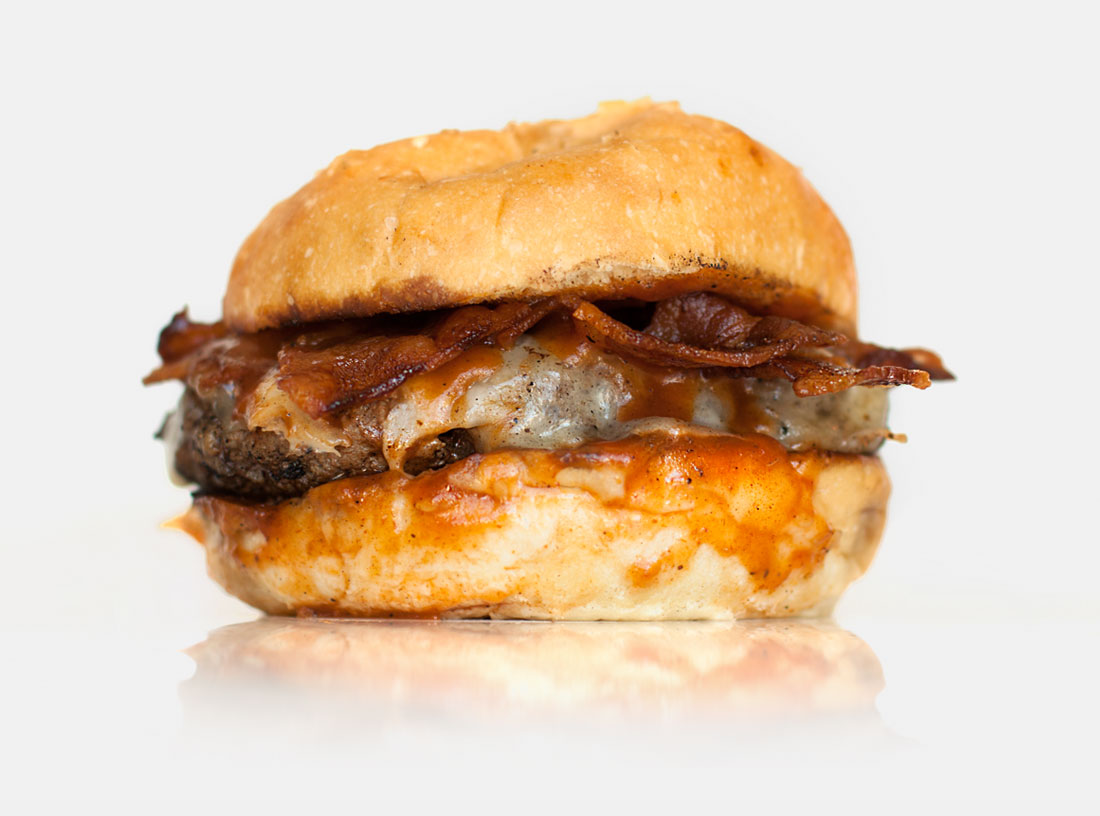
The next hint is the brunch menu: Belgian waffles stuffed with prosciutto and Manchego cheese, topped with fried chicken and drizzled with maple syrup and Makers Mark, Pork Belly filled doughnut holes, bottomless mimosas, etc. As we look over the menu trying to settle on our sliders (beef and blue cheese, lamb and onion, fried chicken and gravy on a fresh buttermilk biscuit...) a man comes in and asks about the day’s special. “I'm doing a burger today,” the bartender answers, “with cheese, bacon and barbecue sauce. It comes with fries and a PBR for twelve bucks.” Everyone orders one. Medium rare.

We make our way to the patio. The high walls are covered with a sprawling mural by Paul Hayes. A handful of other patrons are taking advantage of the Mission micro climate. Two dogs lounge in the shade. We sit at a steeply slanted picnic table as 20th Century Boy crashes to a close and the Kinks drift in, snaking through the pot-laced air. It’s hot and there are too few umbrellas.  

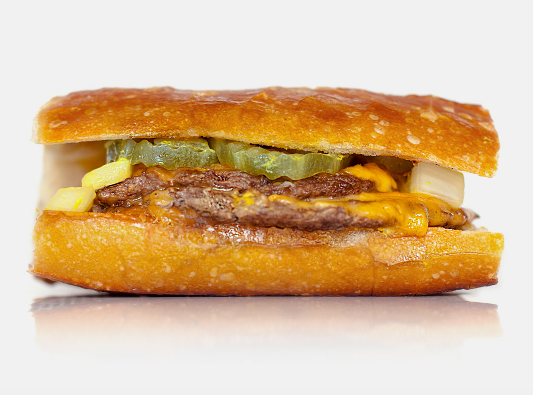
More people wander back. A man and his Pabst. A couple and their cabernet. Our burgers arrive as advertised—pinkish in the middle with all the aforementioned fixings. At most dive bars you can count on the bun letting down an otherwise decent burger. Not at Sycamore. Their bun is soft and airy, with a light crust elastic enough to keep the barbecue sauce from disintegrating the whole thing. The server tells me they come from Chestnut Bakery. It seems symbolic of the city that a Mission dive bar buys artisinal bread from the Marina. But just as there’s no pretense about the place, there’s also no pretense about the burger. Nor is there any vegetable—just a satisfying concoction of sweet, saucy, salty, fatty deliciousness. It’s emblematic of the unifying theory that unites doughnut holes, bacon, never-ending morning mimosas, glam rock and weed: feel-good ingredients only, please. 


The Creative Lesson

The best laid plans. We selected Sycamore specifically for their sliders. That was our plan. We wanted something a little different than your textbook definition burger and we’d heard good things about the Sycamore. But chancing to overhear that there was a special (and it was a burger!) seemed too serendipitous to pass up. As designers we like to plan. Design, after all, is a plan. But as much as we strive to ensure the deliberateness of things, we must remember that it is spontaneity that leaves to discovery.

June 26, 2014 /Christopher Simmons
★ ★ ★ ★

No. 24: The Wisest and Stupidest of Men

8.25 at Red’s Java House
June 19, 2014 by Christopher Simmons in ★ ★ ★

★ ★ ★ Red’s Java House has been a fixture of the San Francisco waterfront since the 1930’s. Back then it was called Franco’s Lunch, but despite that moniker offered an infamous breakfast special: a cheeseburger with a pint of beer.

In the eighty plus years since, Red’s has changed hands a handful of times—first in the 1950’s to carrot-topped brothers Tom and Mike McGarvey (who renamed it after their ginger locks) then again in 1990 and 2009. All, by the way, were San Francisco natives. The Pier 30 dive—halfway between ATT Park and the Ferry Building—is an enduing landmark with a bay bridge view and a very satisfying burger.


Their signature double cheeseburger is made with two thin all beef patties, grilled in mustard and draped with perfectly melted American cheese. All burgers come topped with chunky pickles and thickly-diced onions. Regular burgers come on a standard bun, doubles are served on San Francisco sourdough. The latter is definitely the way to go. The bread has the elastic chewiness of good sourdough. Chewier rolls have the frustrating tendency to squeeze out their contents (unless you eat them like this), but the rolls at Red’s are oversized and because there's no lettuce or tomato to slide around the sandwich holds up fine. It's a warm, hearty, gooey handful of deliciousness. The onions and mustard give it a bracing pungency. The pickles and sourdough a mild tanginess. There’s ketchup and hot sauce on the table if you want it, but honestly the burger is great on its own. 

The walls at Red’s Java House are covered with framed photos and newspaper clippings—souvenirs of San Francisco past. I happened to sit at a table below a series of photos showing my neighborhood in the 50’s, just before my house was built. Back then our street wasn’t even a street—just a grassy hillside above some wetlands that would soon be drained and filled in the name of progress. Like the hills and the wetlands, The City has changed a lot since then. The aforementioned ballpark (built in 2000 to look like it was built in the 20’s) has had three names and numerous expansions in just 14 years. The Ferry Building, which predates Red’s, has also seen numerous transformations—from an active transit center, to office space, to a bustling restaurant and shopping arcade. San Francisco itself has morphed into different incarnations of itself time and time again. Through it all, though, Red’s has remained focused, and humble and small. It feels like a real place, a place with an honest sense of history and a sincere sense of self. 


The Creative Lesson

Only the wisest and stupidest of men never change. (Confucious) When a business finds success (as Red’s has) the temptation is to grow. “How can I scale this model so I can make more money from more people in more places?” But not everything is built for growth, and not everything needs to be.

I’ve run my own design office for ten years now. We’ve always been three people and we’ve always worked from a home office. People often ask me when I’m going to move to a larger office, when I’m going to hire more employees, when I’m going to grow the business. In short, they’re asking, “When are you going to change this thing you love into something else?” The answer is, I’m not.

Growth works for some people and it’s more or less The American Way. Sometimes, though, success depends on not growing, on not chaning. Sometimes it depends on remaining small enough that you can stay close to the work, close to your customers and close to your life.


June 19, 2014 /Christopher Simmons
★ ★ ★

No. 23: Nothing’s for Everyone

$2.95 at Habit Burger
June 12, 2014 by Christopher Simmons

★ I read last week that Habit Burger was named the “best burger in America” by Consumer Reports. You can see from the star rating (and possibly the photo) that I disagree.

Habit Burger may be the most forgettable burger I’ve ever eaten. Honestly. I can’t remember a more forgettable one. It’s only been a couple of hours since I chomped down their signature Charburger but as I try to recall the experience the flavor of other burgers—even awful ones—keeps crowding out the memory.

Their setup is familiar: an all-beef patty, special sauce, lettuce, cheese, pickles and onions on a sesame seed bun. The toppings are fresh, although there is scarcely such thing as a fresh tomato anymore and, fresh or not, you’ll get as much flavor by a biting into crisphead lettuce as you will by looking at a picture of it. To their credit, Habit Burger also uses fresh ground beef and grills it over an open flame. They also caramelize their onions but to be honest I couldn’t taste them through the salt and cheese. The bun comes toasted which, like caramelizing onions, happens to be my preferred preparation. There is a difference, however, between toasted and toast. This was the latter. Expectations of excellence notwithstanding, Habit Burger was a disappointment.

So now I’m struggling to understand both why they exist as a brand and how they topped TMIMR favorite In-n-Out and the very tasty also-ran, Five Guys.

Seriously. The most remarkable thing about Habit Burger is how incredibly dull it is. I’m not just talking about the burger either, but the whole experience. I’ve actually eaten at two locations (just to confirm that my amnesic experience was not an isolated one). Both were in suburban strip malls; one next to a Yogurtland with temporary banners and another next to a Pasta Pomodoro. Both featured a safely neutral decor. The interior of the latter location was accented with what looked like digital prints of acrylic paintings of people enjoying the ‘California lifestyle’ (windsurfing, cycling, etc.) by an artist of unknown origin but by all appearances the work of a reasonable talented but reluctant middle school student forced to take a art class.

On my visit to this location there was a line out the door. Out the door. Past the oversized window vinyl of their oddly akilter logo, out of earshot of the classic rock drifting innocuously through the air conditioned atmosphere of unit 1100 and onto the angular beige hardscape of the Park Place shopping plaza and Archstone residential development. Even the conversation I overheard was boring:

“Hey, this is some line huh?”

“Yeah, and on a Tuesday.” 

“I wonder what's going on...”

“Well, it’s lunchtime, so...”

“Yeah.”

Perhaps, then, it’s no surprise that readers gave Habit Burger an average rating of 8.1 out of 10 (10 being “the most delicious meal you have ever eaten”).


The Creative Lesson

All for nothing. Like many popular products, there are a million options when it comes to burgers: Fast food, gourmet, better burgers, gastropubs, food trucks, popups, and on and on. Everyone, it seems, has an idea of how to make a burger. Or rather, everyone seems to have an idea of how to make money making burgers.

I'm sure the folks behind Habit Burger would disagree, but it really seems to be a chain without purpose. They have reasonable prices and they’re conveniently located. That’s not much to build a brand on. But somehow they have. Without a strong point of view, or a superior product, or a smart ad campaign, Habit Burger is more than a successful business, it’s a suburban American brand.

Marty Neumeier said that a brand is “A brand is a person’s gut feeling about a product, service, or organization.” In other words, a brand is what people agree it is, not what a business says it is. We The People think Habit Burger the best burger in America. It’s confounding. Confronting. Confusing. Maybe I take things too seriously, but I find it a little depressing as well. I guess I’m just one of those people who wants things to be about something; but nothing’s for everyone.
June 12, 2014 /Christopher Simmons

No. 22: Drawing the Line

$5.45 at Whiz Burger
June 04, 2014 by Christopher Simmons in ★ ★

★ ★ Whiz Burger sits at the corner of 18th Street and South Van Ness Avenue in San Francisco’s Mission District. Miraculously, they’ve been flipping burgers there for nearly 60 years.

I’ve driven by 50’s era burger stand hundreds of times over the years. Each time I make a mental note to give it a try—seduced, perhaps, by its disintegrating all-American charm and sheer longevity, but ultimately dissuaded by the swirling trash and laminated color printouts advertising chicken teriyaki. 

Unsurprisingly, we opted for a burger. Whiz offers them up in ten varieties: from cheese to chili, bacon to turkey. We opted for the ‘Whiz’ in part because of its eponymy but also because they drew a box around it on the menu.

The Whiz Burger is 1/3 pound of ground chuck served with bacon, avocado, chopped iceberg lettuce, tomato, onion, pickles, mustard, and mayo on a french(ish) roll. I say ‘ish’ because it is shaped like a french roll, but really it’s just oblong bread. The obvious geometric challenge of how to fit a round patty into an oval bun is resolved by folding the meat over on itself. I wish they took advantage of this peculiarity in some way (melting the cheese between the layers of meat, for example) but alas it is simply a matter of pragmatics.

The burger, while decently cooked, was disappointing overall. The ingredients were fresh but not thoughtfully apportioned. Like the sloppily-folded patty, the toppings seemed haphazardly arranged. The avocado (which ought to have been bacon-adjacent) kept squirting out from under the patty. The chopped lettuce did what chopped lettuce does, which is fall all over the place. Somehow everything—including the overly-generous bun—coalesced into a single, soft, unsatisfying texture. 


The Creative Lesson

Look here! Discussion about design tend to deal with strategy or branding or storytelling or problem-solving, etc. We talk about systems and sustainability and semiotics. We spin stories around new technology and write odes to traditional craft. Sometimes, though, design is graphic. A simple box highlighting a single burger separated it from the fray; just four right angles that said, “We care more about this burger.” So we did too.

June 04, 2014 /Christopher Simmons
★ ★

No. 21: Two Guys Walk Into The Mission…

$11 at Starbelly
May 28, 2014 by Christopher Simmons in ★ ★ ★

★ ★ ★ Starbelly is a casual Castro neighborhood café serving California comfort food in a typically laid back atmosphere. Known for their pizzas, creative wine- and beer-based cocktails, and late hours (by San Francisco standards), they also make a fine burger.

The patty is half pound of Prather Ranch ground sirloin and comes with all the traditional fixings: lettuce, tomato, onions, and the same house-made pickle we discussed in our review of Super Duper (Starbelly and Super Duper are under the same ownership). The challah bun (Pinkie’s Bakery) is super fresh and deliciously buttery, if a tad on the flakey side. We ordered our burgers medium rare (of course). Nathan’s came medium while mine was medium well. Overall the burger was filling and flavorful. Starbelly’s commitment to sourcing quality local ingredients made a positive impression, but the overcooked patty kept us from giving it four stars.

Full disclosure: Starbelly’s owners are clients of ours and we’ve just helped them brand and name their latest restaurant. While we didn’t have anything to do with naming Starbelly, I’m friendly with the people who did, and our former intern designed the logo.

Out of genuine curiosity, I asked our server about the meaning of the name. This was his answer:

“We paid a couple of guys in The Mission to come up with 2,000 names for us. Then the owner’s kids picked the one they liked best.”  

So many things about his explanation are revealing about non-designers’ perception of the creative process, that we had to make it this week’s lesson. Let’s break it down:

First, I love that he characterized their creative partners as “a couple of guys”—not the name of the agency or even, broadly, that is was an agency. Just two dudes. It makes it sound like they took a stroll down Valencia street looking for talented hipsters with access to post-it notes and a dictionary. For those readers unfamiliar with San Francisco, The Mission District is a rapidly-gentrifying corridor once home to muralists, thrift stores, and dance companies and now widely viewed as ground zero for third wave coffee and mustache wax. I love that our server invoked the designers’ location as their sole qualifying credential.

Second, it is telling that he framed the process as “paying…for 2,000 names.” In naming quantity often is inherent to the process, but the truth is you’re paying for one name (or rather, the expertise required to craft a name)—it just may take 2,000 to get there. Viewing design as a quantitative exercise rather than a qualitative one is troublingly common. It suggests that if, after considering the first 2,000 names (or 20 tag lines, or 10 logos, or whatever), you haven’t been introduced one you like, then another 2,000 (or 20 or 10 or whatever) might do the trick. But that’s probably not going to happen. The real trick is to strive for better understanding. Maybe the designer needs to ask new or better questions. Maybe the client needs a new or better way to evaluate the options. Maybe both parties need to revisit the goals, criteria and parameters. It’s the difference between investing and simply playing the lottery.

Lastly, the assertion that the decision was ultimately made by the owner’s children—while probably apocryphal—highlights an important dimension of our cultural relationship to expertise. Since I happen know the “two guys in the Mission” I can tell you that one of them has an MFA in writing, the other a BA (from Harvard) in the Philosophy of Language and Aesthetics. They are qualified and experienced professionals who were hired for their expertise. Since I also happen to know and work with the owner and recently named a new restaurant for him. I can attest to his design savvy and the intense consideration he gives every aspect of his business. Decisions are sometimes made intuitively, but never lightly and always in the context of a considered and well thought out strategy.

It may make for a good punchline to contrast the image of a couple of young hipsters spending weeks churning out thousands of names with the image of a couple of children picking their Seussian favorite, but it’s probably not accurate. And while it pokes light-hearted fun at the apparent futility of creativity—even evoking the common lay-criticism, “My five-year-old niece could have done that!”—it assumes a dispiritingly cavalier attitude toward professional creativity.

In fairness, my exchange with our server was brief. He probably wasn’t involved in the process, and simply provided the highlights of a story he’s heard second hand. I’m not faulting him in any way. It’s a good-sounding story, easily told and easily shared. It is also a humbling reminder of how the design process is viewed and valued by those outside looking in. 


The Creative Lesson

Design design. Design, like any profession, is a specialization. It has its own language, customs, rules, references, history and heroes—most of which are opaque to those outside the profession. Our server’s characterization of the designer-client relationship was a harmless (and amusing) misunderstanding; one that didn’t account for the rigor, perspective or politics of the project. Sadly, however, many should-be savvy clients also suffer these same misapprehensions.

Perhaps part of the reason is that we (designers) haven’t done an adequate job of branding the idea of design. If our cultural fluency with design is to improve, designers and design organizations are going to need to do a better job of making clear what we do, how we do it, and why it matters. We need to do a better job of telling our story.
May 28, 2014 /Christopher Simmons
★ ★ ★

No. 20: Attack of the Killer Tomatoes

$8.75 at 4505 Burgers & BBQ
May 21, 2014 by Christopher Simmons in ★ ★ ★ ★ ★

★ ★ ★ ★ ★ 4505 Burgers & BBQ makes a damn good cheeseburger. Some even call it the Best Damn Cheeseburger. Specifically, that’s what 4505 Meats calls it.

Chef Ryan Farr selects his dry-aged, grass-fed beef from Magruder Ranch, butchers it on-site, and grinds it no more than 12 hours before cooking. Each 1/4" thick patty weighs in at four ounces before hitting the grill, where it sizzles for 90 seconds per side before being dusted with 1/4 teaspoon of finely-ground salt. 

4505’s deliciously savory buns are made in-house. Aside from the requisite flour, yeast, egg and milk, Farr adds sliced scallions and pecorino to the mix. The scallions add a mild pungency, while the cheese lends the bun its creamy texture. The fresh-baked buns are brushed with butter and grilled (also for 90 seconds) until they develop a crust firm enough to withstand the juice that oozes from the tender patty.

Topping-wise, 4505 keeps things fairly traditional. Mayonnaise, sweet relish, ketchup and mustard are combined into a single sauce in a sequentially diminishing ratio of 2:1 (half as much relish as mayonnaise, half as much ketchup as relish, etc.). A slice of iceberg lettuce mediates the transition from burger to bun, aided by thinly sliced red onions and a 1/16" thick slice of gruyere. The cheese is actually added to the patty after the first flip, allowing it to melt perfectly over the meat. Finally, a 1/4" slice of tomato is added, but only if they’re in season. 

In a later review I may address the thinness of onions, but the standout ingredient here is the missing tomato.

As noted in our review of Mission Beach Café, even a tiny tomato can play a vital role. Indeed, 13 of the 20 burgers we’ve reviewed to date have included some variety of solanum lycopersicum. For some it is integral to the burger concept. For most it feels more like an obligatory add-on.

After taking so much care to personally select their beef, bake their own bread, and cook and dress their burger to such exacting standards, 4505 Burgers & BBQ’s conditional commitment to the tomato is as understandable as it is laudable. I’m not going to get into just how awful off-season tomatoes are, but Barry Estabrook’s book, Tomatoland, will turn you off of them forever. Imagine tomatoes grown in sterilized, plastic-covered sand, sprayed weekly with any number of 110 different pesticides, herbicides and fungicides, picked while they are hard and green, then inundated with ethylene gas (to turn them red) and you begin to understand why chef Farr refuses to desecrate his burgers with them. It’s part of his unwavering dedication to quality and control, and one more reason that the Best Damn Cheeseburger just may just be the best damn cheeseburger.


The Creative Lesson

Beware the weakest link. I once worked on an annual report for an oncology-focused biotech company. The content was based around heroic profiles of the scientists, researchers and caregivers involved with their clinical trials. Early concept layouts included dramatic full-page portraits with each profile.

I spent a week obsessively kerning the text (yes, every word), hanging punctuation (in Quark 4.5 mind you!), and meticulously eliminating every word break. We worked closely with the printer to test quad-tone effects for the portraits, find the right combination of paper weights, and experiment with metallic inks on uncoated stock.

The piece earned me my first Type Directors Club award, and to this day I’m deeply embarrassed by it.

At the eleventh hour, the client decided that the people they’d tapped for the profiles were too important to be troubled for a photo shoot. Instead they had them send us snapshots of themselves which we then blew up to the full-page format they’d fallen in love with. The results were hideous. Back then I didn’t have the courage (or the authority) to insist on a change of direction—nor the insight to realize that everyone would be better off if we just eliminated the photos altogether.

For those interested in excellence, only excellence can survive; design, after all, is only as strong as its weakest element. From now on I’m calling these destructive elements killer tomatoes.
May 21, 2014 /Christopher Simmons
★ ★ ★ ★ ★
mine_acme_burgerhaus.jpg

No. 19: Disconnected

$7.45 at Acme Burgerhaus
May 14, 2014 by Christopher Simmons

★ As far as we can tell, Acme Burgerhaus is no longer in business. That’s not a surprise.

Acme Burgerhouse was all sorts of confusing. Let’s start with the fact that every instance of their name was rendered in a different typeface—with three variations on the façade alone. Now, not everyone has a nuanced sense of design, but certainly most people (business owners especially) understand the value of consistency.

The Acme Burgerhaus web site is also profoundly confusing. On it, the establishment is described thusly:

“is to create hamburger recipes from kitchens all around the world and offer them to you in a fun lively environment. Burger fusion is a party of day-to-day life for many home kitchen cooks. Acme Burgerhaus takes that home recipe idea and offers it for sale in our commercial kitchen. Our goal is to make you smile every time you think of going to grab a bueger. Creating unique combinations of ingredients and infusing them in 100% organic beef is the new and innovative way to customize your burgers”

Again, I realize that writing isn’t everyone’s bailiwick (and, yes, I make my share of typos), but this messaging is all over the place. From the first line (which lacks a subject) to the last there’s not one correct sentence to be found. Even ‘burger‘ is spelled wrong. Oy. Though new, innovative and fusion are Acme’s frequently-used buzzwords, in other materials they describe themselves as a “straight-ahead burger joint” and “part roadside diner” (they never mention what the other part is).

Now on to the burger. Although the Yelp reviews often lauded Acme’s creations—from a shrimp and scallop infused patty to Niman Ranch lamb with pine nuts, sumac and mint—we opted for a basic cheeseburger. For that they offer a half-pound patty with American cheese on a ciabatta bun and direct you to the condiment bar. The condiment bar is directly opposite the order counter. When your number is called you have to cross through the order line to get to it, then cross back through with your fully-loaded burger. 

The patty itself was decent quality, though not the freshest we’ve had. It was unseasoned, a little on the chewy side, and ultimately forgettable. The bun could be described the same way. The condiment bar offered a modest selection of room-temperature lettuces, slowly wizening tomatoes, sliced jalapeño and onion, and a basic roster of sauces with which to denigrate your burger. Seriously, condiment bars are the worst idea. They’re never fresh and seldom inspired, though they excel in offering you opportunities to ruin your burger. I feel Acme could have handled that responsibility with ease.

All of this disorder is further confused by Acme’s checkered history of closing, reopening, expanding, closing one location, reopening and now (seemingly) shuttering altogether. When I called their number to confirm reports of their closure the line was disconnected, but directory assistance picked up and offered to recommend similar establishments in the same area. I think we could have benefitted from that offer in the first place.


The Creative Lesson

Reconnect. I’m tempted to say that the creative lesson here is simply to get your shit together. Acme Burgerhaus was just a mess from start to finish. But my suspicion is that the turmoil was more a symptom of unfocused leadership and unmotivated management than anything else. Clearly they started with a mission. From all reports when Acme was at its peak (you’re welcome for that little gem) it was well-liked and offered a quality product and experience. Somehow over the years it lost momentum, then direction, until finally all was lost.

Great design (like any great thing) begins with great leadership and clear vision. It begins with understanding why you’re doing what you’re doing. Next you have to figure out how you’re going to do it. When things start sliding off the rails, you have to return to the why then regroup, refocus and recommit. You may need to take some time out to do that, but when you return make sure you do so with renewed clarity and commitment.
May 14, 2014 /Christopher Simmons
mine_mission_beach_cafe.jpg

No. 18: A Tiny Tomato

$13.50 at Mission Beach Café
May 07, 2014 by Christopher Simmons in ★ ★ ★

★ ★ ★ Mission Beach Café has occupied the sage green Victorian at the corner of 14th and Guerrero since 2007. The tightly-packed space is sophisticated but laid back. Its high-backed chairs and soft carpeting are playfully at odds with the oversized photographic prints of abandoned warehouses that line the walls and the vintage Eames screen that separates the dining are from the kitchen. A single red wall accents an otherwise neutral interior.

To our left a mother and daughter shared a leisurely lunch. Behind us one casually- but well-dressed man earnestly tries to impress another, his blue eyes never breaking contact with his counterpart across the table. It’s unclear whether he’s on a date or a job interview. Behind them two gentlemen in their 90s with papery skin and broad smiles take small sips of coffee and enjoy having nowhere else to be. The lone empty table is soon filled by a young couple—he in sandals and a beard, she in a wrinkled blue dress. Their skin radiates the warmth of their spirit and the energy of captured sun. 

Our burgers arrive: two round buns on a round white plate. A thick patty of Prather Ranch ground beef sits atop one of the buns, draped with a melting slice of aged gouda and some caramelized onions. Deep grill marks char the underside of the other bun, on which rests a broad leaf of lettuce. A small pile of golden fries (expertly cooked, by the way) adds a little chaos amongst the order. Finally, a tiny slice of tomato punctuates the scene.

The tomato is an enigma. Singular and no bigger than a silver dollar, it adds almost nothing to the flavor of the burger. When I finally do happen upon a bite, it is a distraction from the otherwise savory combination. We wonder aloud what could be the point of it. Everything about the burger is nuanced—the salted Lost Coast beef, the smokey aged cheese, the zesty garlic aioli, the sweetened caramelized onions, right down to the perfectly grilled bun. And then we realize we’ve misunderstood the tomato’s purpose; it’s not a gastronomic statement, but an aesthetic one. Removed, the plate is uniform and unexciting. It needs a moment of contrast to bring the dish to life. Like a pocket square or Christian Louboutin sole, it is a moment of exuberance that frees form from the strict confines of function. 

To see for yourself, visit our Facebook page for a side-by-side comparison. Better yet, head on over to Mission Beach Café and enjoy one of the better burgers San Francisco has to offer.


The Creative Lesson

Form is Function. When questioned about whether or not design should be useful, Charles Eames answered, “Yes” but warned that the “use” might be very subtle. Considered as an ingredient of the burger, the tomato isn’t particularly useful. It is an extraneous formal element for which (as far as flavor is concerned) there is no functional justification. Considered as an element of expression—an ingredient of the visual experience—its function is essential.

Beware of slavishly tethering yourself to single interpretation of function. Consider wit, whimsy, joy, and style for their functional dimensions as well.
May 07, 2014 /Christopher Simmons
★ ★ ★

No. 17: It’s All in Your Head

$11 at Pal's Takeaway
April 30, 2014 by Christopher Simmons in ★ ★ ★

★ ★ ★ By night La Movida is a casual restaurant and wine bar. By day it is home to Pal’s Takeway, a tiny sandwhich shop full of big ideas. Every other Wednesday Pal’s also serves burgers.

Pal’s is all about experimentation. Owner and chef Jeff Mason is constantly tinkering with his recipes, regularly creating new sandwiches and serving up creative takes on old favorites. There’s no guarantee that any given sandwich will be on the menu from one day to the next so each visit requires a leap of faith, the reward for which is sheer delight. Here are a few of Jeff’s past creations (click here if you want to skip straight to the burger):

Smoked Trout
With daikon sprouts, spicy apples, and labneh

Roasted Turkey Breast
With bacon, pimento-cheddar spread, and arugula

Cold Poached Albacore
With cornichon, arugula, roasted cherry tomato relish, and potato chip (yes, in the sandwich)

Banh Mi
Becker Lane Lao roast pork with Blue Herron baby scallion, cilantro, carrot, daikon, cucumber and jalapeño

Egg Salad
Riverdog real free-range egg salad with asparagus

Roasted Pig
With cheddar ale sauce, pickled shallot, wild arugula, and mustard

Lamb
Sonoma baby spring lamb porchetta with roasted eggplant yogurt dressing, pickled onions, greens, and Aleppo pepper

Pork Sliders
Becker Lane pork with choice of hoisin, ginger, lime, and black coffee BBQ sauces

Pal’s also sources some of the finest breads around. Here in the Bay Area we’re so spoiled on Acme Bread as a kind of everyday loaf that it’s hard to remember just how exceptional it is. Depending on the creation you may find your Pal’s sandwich between two slices of Acme, Josey Baker, or Fireband. Our burgers were served on a beautiful, sweet, fluffy bun from Marla Bakery. 

About that burger.

Jeff developed his patty with Marin Sun Farms using a combination of sirloin, brisket, chuck, and dry-aged beef fat. It’s a fantastic, very juicy, five-ounce piece of meat which he smash grills until it forms a crisp crust. The inside is so rare that in any other establishment you’d probably send it back. But Jeff knows what he’s doing and we enjoyed ours without incident. Like his other sandwiches, the burger offering varies constantly. On our visit we were treated to toppings of arugula, roasted cherry tomatoes, and a house-made pimento cheese spread. Contrasted with the other ingredients, the spread seemed at first a peculiar addition. It was salty and a little spicy—like a dressed up Cheese Whiz. (Quick aside: Kraft's website is as awful as their foods. Someone please help them). Oddly, though, it worked, and after a few bites we came to appreciate it as an indulgence—both of taste and creation. 

Pal’s burger is whimsical and fun. Though we gave it only three stars, it’s considerably better than any other three-star burger we’ve tasted so far. I certainly recommend giving it a try.

After our meal, I spoke with Jeff about his process. How does he constantly come up with new variations? Does he research different foods and combinations? Does he experiment, iterate, and refine? Does he have test subjects who try his concoctions and give him feedback? The answers were no, no and no. “Basically,” he says, “I just dream them up in my head. I know enough about food now that I have a pretty good idea what something will taste like just by imagining it. Then I make it. If it tastes as good as I imagined, I make some adjustments. If it tastes better than I imagined, I serve it.”

Jeff, in other words, is like any seasoned creative professional. Ideas come fast and freely and he has enough practice behind him that he can prototype in his head. He doesn’t rely on research or user feedback to validate his vision. Instead he brings the value of his own considerable experience to the table. He sets high conceptual expectations for himself, and doesn’t launch a new idea until the craft exceeds them. 


The Creative Lesson

Trust your insticts. There’s a place in design for the process you may have inferred from my questions to Jeff: define, ideate, prototype, iterate. A so-called design thinking process would preceed the definition phase with phases for understanding and observing—and include multiple rounds of testing and user feedback at the iteration stage. If you’re solving a complex problem or building solutions at scale these processes are useful and probably necessary.

But design isn’t always about using what other people know to make things that other people want. Sometimes it’s about offering something new—something that comes from a place that no one but you can imagine. I’d argue that the best design always requires an element of intuition. And though most design is made better by collaboration, every once in a while it is the passionate work of a solitary genius.

Go have a Pal’s burger. You'll see what I mean.
April 30, 2014 /Christopher Simmons
★ ★ ★
Umami Burger

No. 16: Accounting for Taste

$11 at Umami Burger
April 23, 2014 by Christopher Simmons in ★ ★ ★

★ ★ ★ In 1908 a Japanese chemist named Kikunae Ikeda patented the process of isolating C5H8NO4Na from seaweed and, later, wheat flour. The compound is more commonly known as monosodium gluatamate but most commonly referred to as MSG. Ikeda saw huge potential for its flavor-enhancing properties and began marketing the food additive a year later. The taste, he thought, was so unique that he coined a new word to describe it: Umami.

Translated literally, umami means “pleasant, savory taste” (as distinct from the four tastes we are biologically equipped to identify: sweet, sour, salty, and bitter). Despite its origin, umami isn’t solely achieved by the addition of MSG. Many foods have natural umami, including aged meat, cheese and shellfish. These foods are naturally high in glutamates and thus impart the umami flavor. In 2009—100 years after Ikeda’s discovery of MSG—scientists discovered that our tongues do in fact have a receptor activated exclusively by glutamate. That same year, Adam Fleischman founded Umami Burger in Los Angeles. It now has 23 locations (including two in San Francsico) with ambitions expanding to 150 or more.

Although your average burger is most likely an umami experience (beef, cheese, and tomatoes all have naturally-ocurring glutamate), the capital-U Umami burger is singularly dedicated to promoting this unique flavor profile. 

Umami fashions its patties from American Waygu beef, which they grind in-house daily (they also make their own buns). To further enhance the umami flavor, the meat is seasoned with soy sauce and dusted with a mixture of ground-up dried porcini mushrooms and dried fish heads. Their signature burger includes caramelized onions, shiitake mushroom, and roasted tomatoes. Shitake mushrooms have a powerful umami flavor, while tomatoes are somewhat subtler. The roasting also brings out a faint sweetness which combines nicely with the earthy mushroom. Finally, a savory (err...umami) parmesan crisp seals the deal. It’s worth noting that, among cheeses, parmesan has the most potent umami flavor with 1200mg of glutamate per 100g.

Besides its flavor, several things distinguish an Umami burger from other hamburgers. The entire burger is hot—no cold juicy tomato, no crisp lettuce. I’ve long held that combination of hot and cold, soft and crisp is integral to the construction of a good hamburger. Even Bar Jules’ completely undressed burger offers a tart, crisp salad as a complement. But Umami eschews this convention, as it does many others, in its tenacious dedication to a solitary flavor experience.

Another distinction is its incorporation of cheese. While you can usually rely on a good cheeseburger to include a gooey slab of melted American or cheddar, Umami’s grilled parmesan crisp adds a savory, delicate crunch. While I personally dislike the flavor, it is a sophisticated choice that many will appreciate. 

The final distinction of the Umami burger is its construction. Unlike conventional burgers in which the ingredients are stacked vertically (such that each bite offers a consistent survey of the ingredients), we watched as the cook arranged the toppings carefully in horizontal sequence. The first few bites were exclusively dedicated to the shiitake mushroom, followed later by the sweet roasted tomatoes. It is a delightfully thoughtful touch.

The flavor profile of the Umami burger is so distinct from that of any other burger it’s hard to place it in the same category. Like the aforementioned offering from Bar Jules, it pushes the definition of the burger genre into unfamiliar (and sometimes unsettling) territory.

And perhaps that’s the problem.

As much as I admire the inventiveness, skill and vision that goes into every Umami burger, it is so far outside its category that I have a difficult time relating to it as a burger. Without the security of that orientation, my relationship to its unique flavor is somewhat untethered. I find those flavors overpowering and a little too self conscious—they make such an earnest effort to be recognized as different. Shitake upon Waygu upon tomato upon soy sauce upon fish heads upon parmesan is—for me—too much of a good thing. Though each element was selected for the subtlety of its flavor, as a whole the burger is ironically lacking in nuance. 


The Creative Lesson

Borderline Taste. Last week I was effusive about the Bar Jules burger. Curiously, everything I admired about that burger—its category-challenging point of view, quality ingredients and expert preparation—also describe Umami Burger. But while I loved (and still think about) the former, I was non-plussed by the latter. That, I think, is the greatest risk in standing that far out from the crowd; taste becomes a decisive factor.

Objectively, Umami burger does everything great design should do. Subjectively, though, it just isn’t my taste. That’s the consequence of assuming a strong point of view; design outcomes will be located on the fringes of familiar. Those borders are narrow territory—occupied by the adventurous and defended by the loyal. Within them you’ll often find a core constituency of passionate supporters, while those with different tastes and values will find themselves on the other side of the wall.

NB: Nathan gives the Umami burger an unequivocal five stars. We previously disagreed sharply on Bar Jules Burger. Stay tuned for a bonus post exploring the distance between our divergent opinions.
April 23, 2014 /Christopher Simmons
★ ★ ★
  • Newer
  • Older


© 2014 MINE™ All Rights Reserved (but, you know, ask us
 if you want to republish anything and we’ll probably say yes).
Subscribe via RSS. | About the Author.